BACK TO ALL WORKA bathroom wipe brand that made the whole thing feel less weird
RCA set out to make a product people actually wanted to keep stocked, without the usual awkwardness, cheapness, or overly feminine branding that tends to come with the category. So we built an identity that made it feel fun, friendly, and easy to live with.
CLIENTRCA
SERVICESBranding
platformBrand system
statusComplete
-the brıefA wipe brand for people who want cleanliness without the awkward shopping experience.
RCA was built around a simple idea: bathroom wipes should not feel embarrassing, overly clinical, or weirdly gendered.
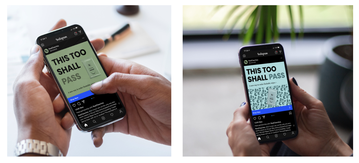
The product itself solves a very practical problem. Instead of having to remember to buy wipes, run out at the wrong time, or stand in an aisle choosing between products that feel either babyish, overly feminine, or vaguely medical, RCA makes the whole experience easier. It’s a subscription-based product that delivers automatically when people need it.
The brand needed to reflect that convenience, but also the attitude behind it. RCA wanted to make the category feel lighter, cuter, and way more fun. Not childish, not gross-out humor, and not sterile. Just witty, approachable, and genuinely enjoyable to interact with.
-the challengeHow do you make a bum wipe brand cute and funny without making it ridiculous?
That was the real tension in the project.
The whole point of RCA was to bring fun into a category that usually feels awkward or forgettable. But there is a thin line between playful and silly. If the branding leaned too hard into toilet humor, it would lose trust. If it became too polished or serious, it would lose the charm that made the concept interesting in the first place.
There was also a positioning challenge. A lot of products in this space are visually coded in one direction or another, often either feminine and soft or plain and functional. RCA wanted to sit in a more unisex space, while still feeling cute and full of personality.
And because the product is built around repeat delivery, the brand had to do more than look good once. It needed to feel lovable enough that people would want it in their home, remember it, and enjoy receiving it again and again.
-THE APPROACHBuild a visual identity that felt cheerful, easy, and unmistakably modern.
The identity was designed to make the product feel less awkward and more like something people would be happy to subscribe to.
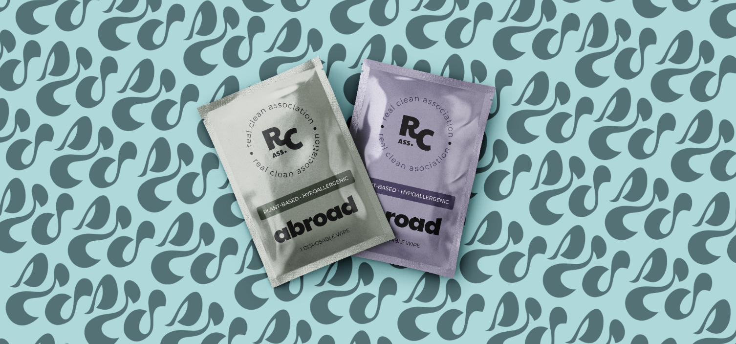
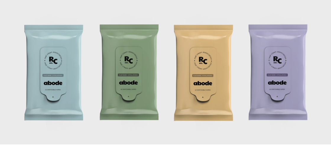
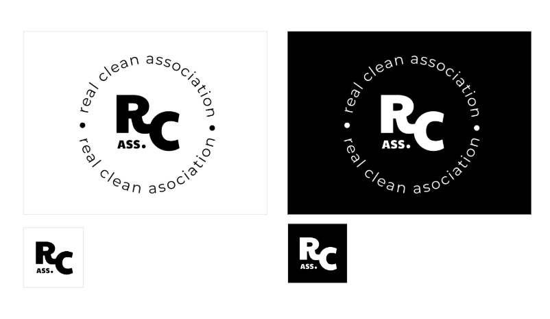
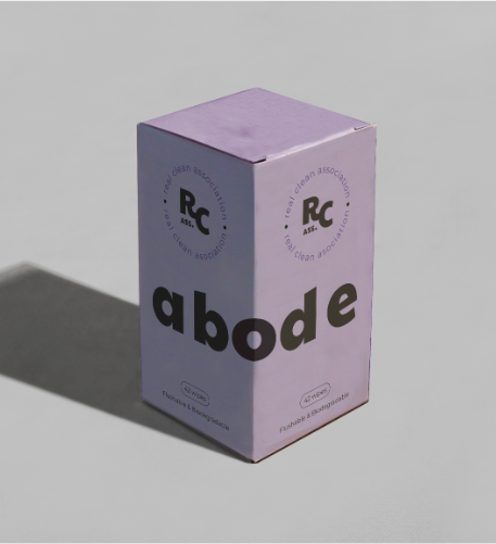
We leaned into a playful tone from the beginning, but kept the visuals clean enough that the brand still felt credible. The typography pairing gave us that balance: Poppins brought a rounded, approachable, modern feel, while Georgia added warmth and a little personality. Together, they created a system that felt friendly, slightly cheeky, and easy to read across packaging and brand applications.
The logo direction embraced the humor of the name rather than hiding from it. Instead of trying to make the brand feel overly serious, we used a visual language that made it feel self-aware and confident. The identity says: yes, we know exactly what this product is, and no, it doesn’t need to be awkward.
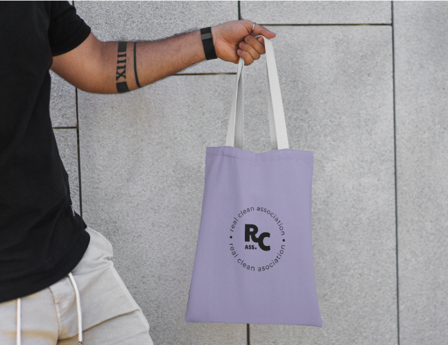
The color palette played a big role in making the brand feel more inclusive and fun. Rather than defaulting to expected category colors, we built a softer, more playful palette that felt cute without tipping into overly sweet or overly feminine territory. The result was fresh, light, and flexible enough to appeal across different audiences.
We also introduced a bold pattern system that added energy and memorability to the brand. This is where a lot of the wit comes through. The patterns gave the identity movement, humor, and a slightly quirky edge, helping RCA feel like a real brand with a point of view rather than just another hygiene product.
Across the system, the goal was consistency without stiffness. The brand needed enough structure to work across packaging, digital touchpoints, and subscription-related assets, but enough playfulness to make the entire experience feel enjoyable.
-the RESULTA cute, witty brand that made an awkward category feel easier to buy into.
The final identity gave RCA a distinctive place in the market: fun, unisex, approachable, and memorable.
It turned a product people usually buy as an afterthought into something with actual charm. The branding made the experience feel lighter and more modern, while still keeping the product clear and easy to trust. Instead of feeling like a boring necessity or an embarrassing purchase, RCA felt like something smart, useful, and a little bit delightful.
The system translated well across packaging concepts and gave the brand a strong foundation for subscription-based growth. It had enough personality to stand out, enough clarity to feel credible, and enough flexibility to grow with the business over time.
Most importantly, it matched the idea at the heart of the brand: make the whole thing easier, make it less awkward, and make it fun.
“Working with Derin and Nicole felt incredibly easy from day one. They completely got the vision for RCA and brought it to life in a way that felt playful, distinctive, and spot-on for the brand. The process was seamless, collaborative, and genuinely enjoyable. They were quick, thoughtful, open to feedback, and deeply invested in getting every detail right. We came out of it with a brand that feels fun, clear, and so much stronger than what we had imagined at the start.”
— ari newman