

BACK TO ALL WORKThe fourth website.
Finally the one that lands.
The Hankar Sisters had been building a healing and retreat business for years. The work was powerful, the offer was rare, and every attempt to present it online had fallen short. Zero conversions, a 57% bounce rate, and a site that looked like every other wellness brand. We changed that.
CLIENTHankar Sisters
SERVICESUX strategy, web design, brand guidelines
platformSquarespace
status-the brıefTwo sisters.
Four years of work.
A site that wasn't doing it justice.
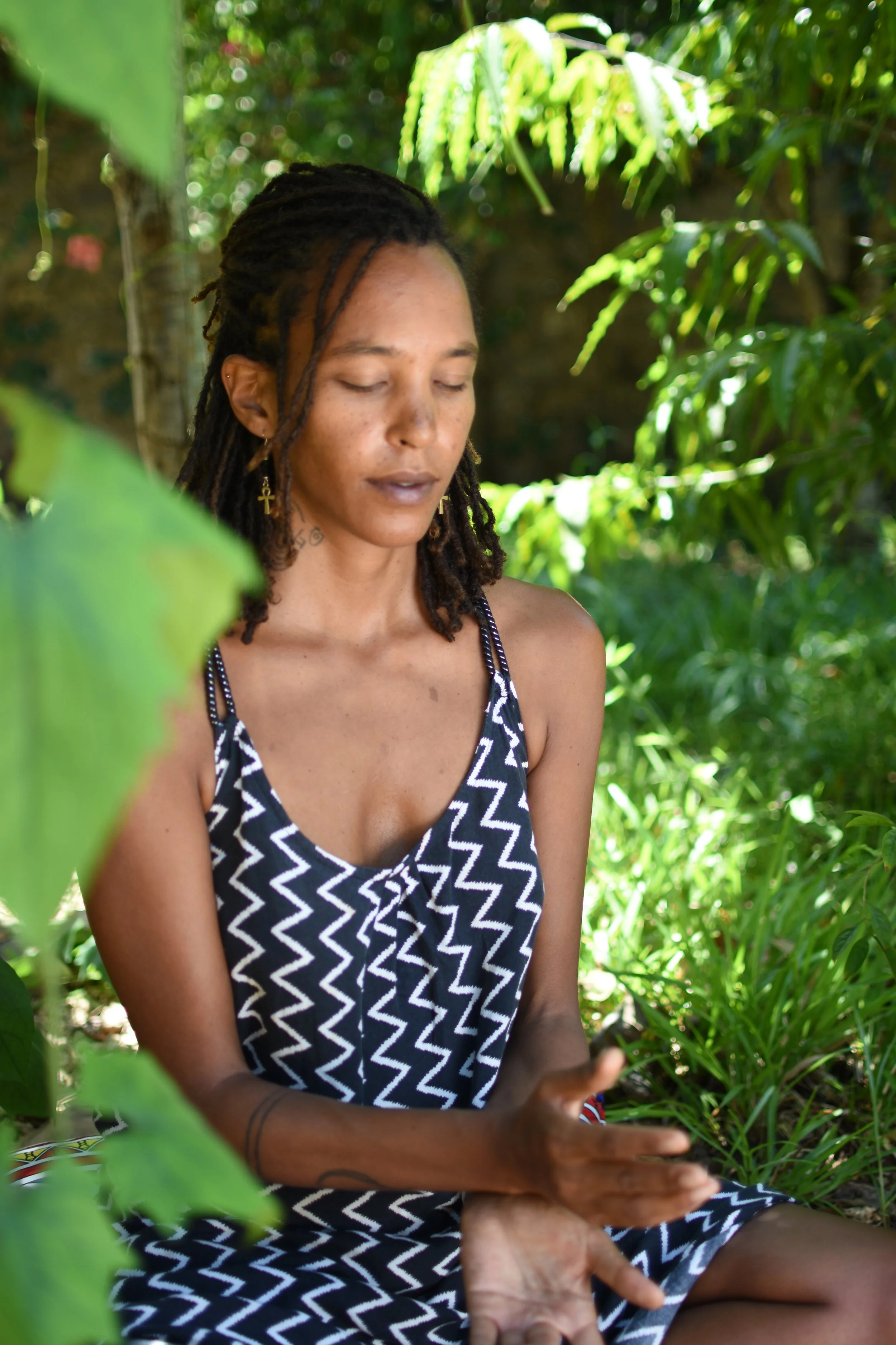
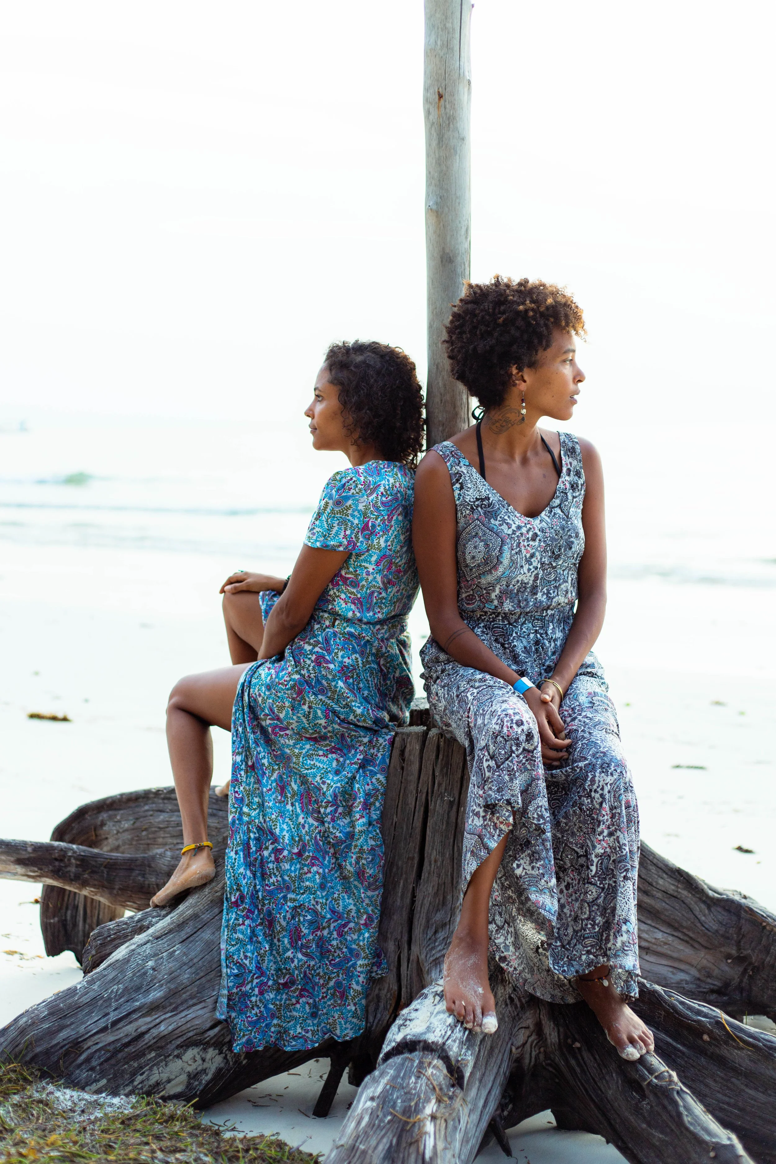
Kaya and Nicole Hankar run somatic healing retreats and nervous system programs for high-capacity leaders. Their flagship offer is genuinely rare: a private residency at House of Afya in Diani, Kenya, where clients spend several days in a space physically designed for deep transformation work. They also run a suite of online programs for those who aren't ready for immersion.
Their existing Wix site wasn't carrying any of that weight. Traffic was real, sessions ran over four minutes, and the content was clearly resonating on some level. But no one was booking. No one was even clicking the contact button. This was the fourth version of their site, and they had never quite landed what they were trying to express.
They came to me not just for a redesign, but for someone who could see the full picture: audience, offering, journey, and brand. Someone who could structure what they had been feeling their way toward for years.
-the challengeThe audience was arriving. The site just wasn't converting.
The analytics were stark. In the 30 days before the redesign, the site had 77 unique visitors spending more than four minutes on average. That kind of session time means genuine interest. But the retreat page, the most powerful page on the site, was exiting visitors at 60% and generating zero inquiries.
The visual problem was just as serious. The site blended into the noise of every other holistic wellness provider — soft florals, vague spiritual language, no clear sense of what was actually on offer and for whom. Nothing about it communicated premium. Nothing pointed to the fact that these women had built something rare: a physical space in Diani, a deeply developed methodology, and a track record of transformation with leaders and executives.
The site also lacked structure. Three high-performing pages, none of them linking to each other with any logic. An About page that acted like a dead end. No application path. No way for someone who was interested to take a clear next step.
"When you're really in it, there are sometimes things that you miss. This has been such a great experience."
— KAYA HANKAR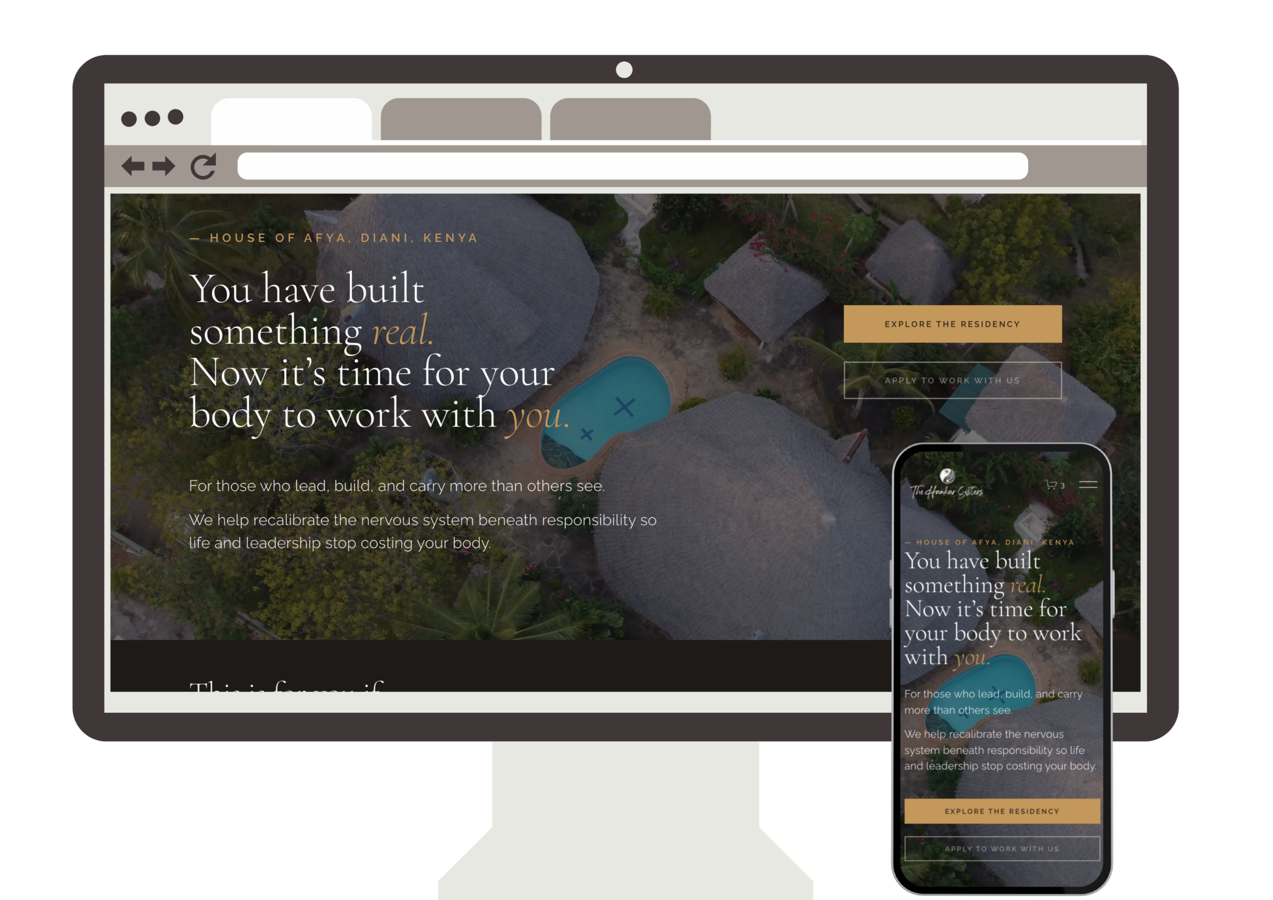
-THE APPROACHStrategy first.
Design second.
Always.
Before a single page was designed, we ran a full UX strategy workshop. The goal was to get precise about who was actually coming to the site and what they needed to feel at every stage of the journey. What we named Sarah — a 45-year-old business owner in Nairobi, succeeding externally and running on empty internally — became the anchor for every decision that followed.
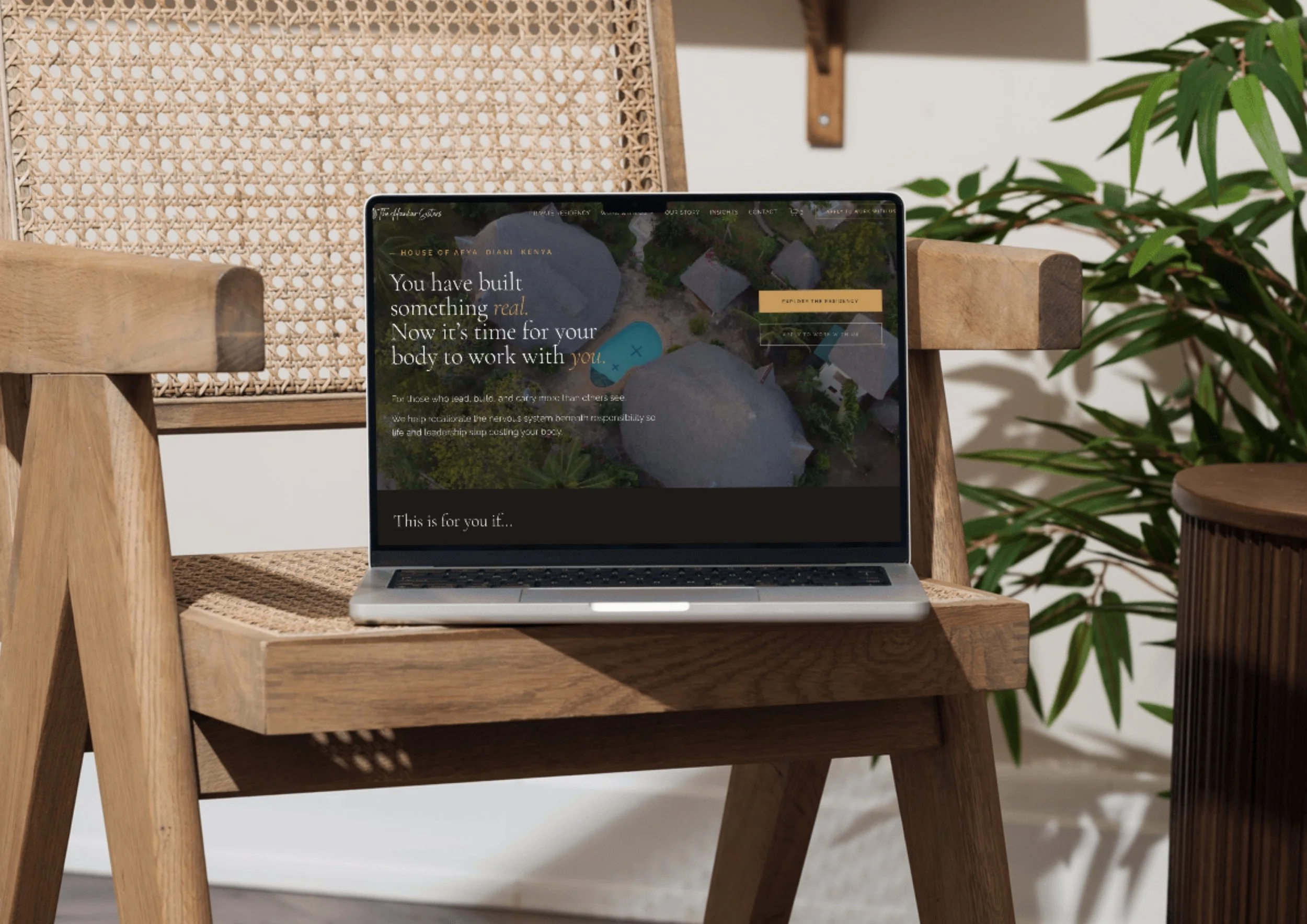
From that session, we mapped a complete offering ladder, a prioritized sitemap, conversion logic for each page, and a content direction that spoke to symptoms Sarah hadn't said out loud yet. We also agreed on something strategically important: the Private Residency in Diani would be the hero offering, not buried alongside the online programs. It was the most differentiating asset they had. The site needed to lead with it.
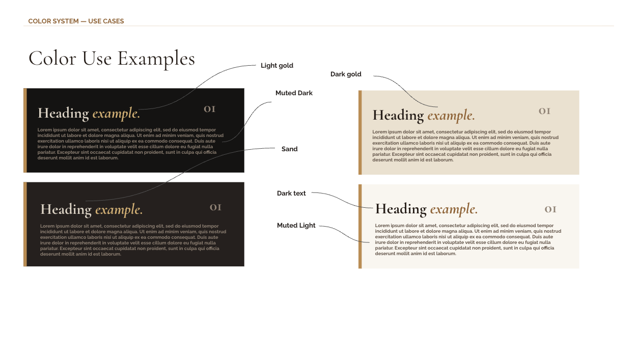
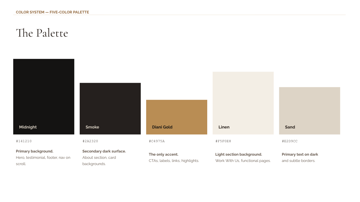
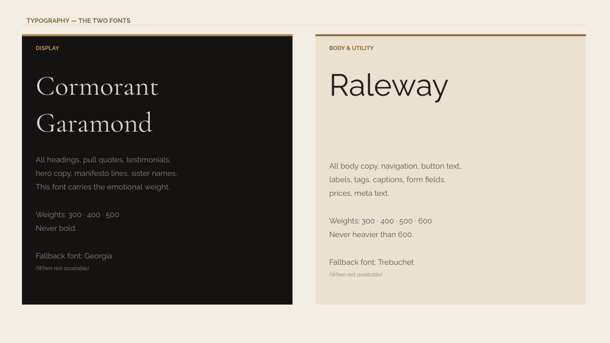
The design followed the strategy. A dark, grounded palette that matched the emotional depth of the work, broken by lighter sections at key decision moments. Typography that was elevated without being cold. The sisters visible early. And an application form instead of a contact form, because the language of inquiry signals safety to someone who isn't sure they're ready.
-the RESULTPremium.
Clear.
Finally theirs.
The finished site looks and feels like the work it represents. It's grounded without being heavy. It's premium without being cold. Sarah lands on the homepage and sees herself in the first scroll, without the site ever having to say a word about "wellness."
The Private Residency is front and center, treated with the visual weight it deserves. The online programs are organized by depth, not by complexity, so visitors can self-select without feeling overwhelmed. The application path is clear, low-friction, and designed to signal safety at the moment of action.
From the first reveal, the reaction said everything. The sisters arrived at a page that — for the first time across four iterations — felt exactly like them. Elevated, structured, and honest about what they offer. It immediately catches curiosity rather than reassuring skepticism.
The brand guidelines deck means that direction doesn't get diluted over time. Every future asset they build, from social content to pitch materials, has a clear reference to come back to.
"Derin captured exactly what we had been trying to express. For the first time, our site feels clear, premium, warm, and truly aligned with our brand. It flows beautifully, guides people naturally, and feels exactly like us."
— Kaya and Nicole Hankar, The Hankar Sisters