BACK TO ALL WORKA website that stays out of the art’s way
Burcu Gökçek is a contemporary artist whose paintings have been described as film stills for feelings you can't quite name. She needed a website that let the work do the talking. So we built one that does exactly that.
CLIENTBurcu Gökçek
SERVICESWeb design, UX direction
platformSquarespace
status-the brıefThe work is quiet and layered. The website had to be too.
Burcu is a Pratt Institute-trained painter whose work has been shown at artSümer in Istanbul, Ferda Art Platform, and was highlighted by Wanderlust magazine as one of the artists "destined for big things" coming out of Istanbul's contemporary scene.
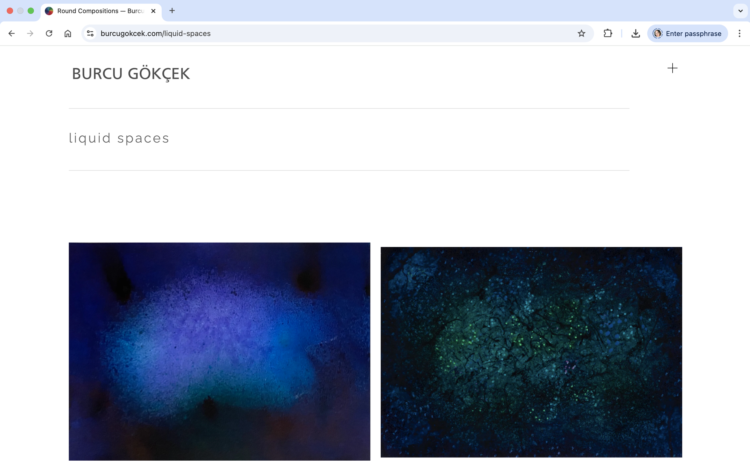
Her art sits in a specific space. It looks like domestic interiors, tennis courts, stairs, empty rooms. But it's really about what it feels like to be a person in those spaces. The solitude. The displacement. The strange tension of feeling like a stranger in familiar places. Critics have described her paintings as having no visible narrative, functioning more as film stills where the viewer fills in what happened before and after each frame.
She came to me with a clear need: a portfolio site that would serve as a professional home for her work. Something a gallerist, curator, or collector could land on and immediately take seriously. No gimmicks, no visual clutter, no personality from the website itself. Just the art, organized cleanly, presented well.
-the challengeMost artist websites try too hard. This one needed to try less.
The biggest trap with artist portfolio sites is that the designer starts designing. Fancy transitions, bold typography, creative layouts, signature color palettes. All of it competes with the actual art. And when the art is as subtle as Burcu's, that competition kills it.
Her paintings rely on quiet tension. Muted palettes, empty space, light coming from nowhere in particular. If the website had its own strong visual identity, it would either clash with the work or dilute it. The site needed to function like a gallery wall: white, neutral, structurally invisible.
The other challenge was practical. Burcu has over a decade of work spanning painting, sculpture, video, and performance, organized across multiple exhibition series. The site needed a structure that could hold all of it without feeling overwhelming. A visitor had to be able to go from landing page to a specific painting in two clicks, but also be able to browse and discover work they didn't know they were looking for.
-THE APPROACHStrip it back. Let the paintings breathe. Build everything else around that.
The site runs on Squarespace, which made sense for Burcu. She's an artist, not a developer. She needed to be able to update her portfolio herself without worrying about breaking anything, and she needed the site to feel intentional without requiring constant maintenance.
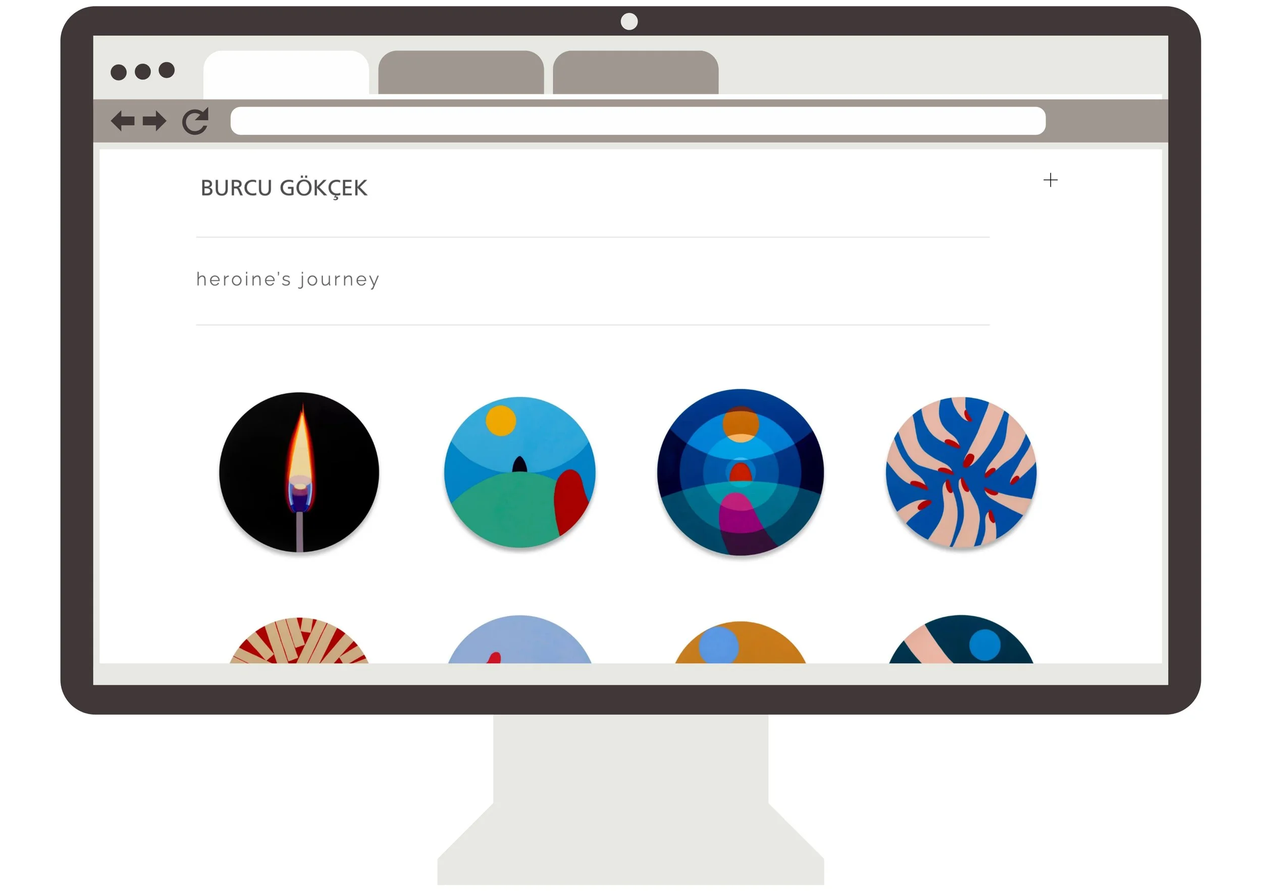
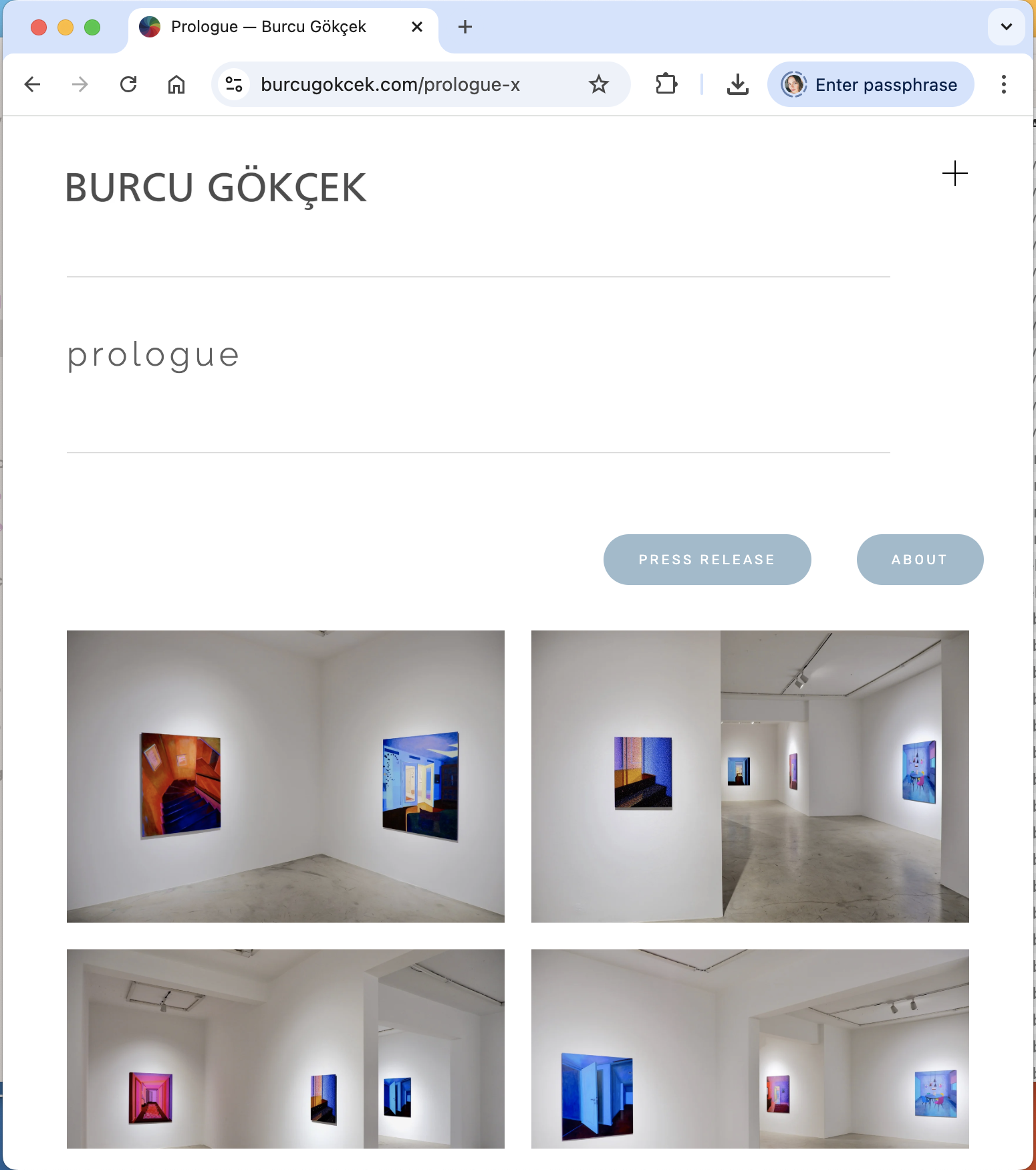
We started with the navigation. Burcu's work spans over a decade of painting, sculpture, video, and performance, organized across multiple exhibition series like Prologue, Heroine's Journey, Folding Air Stretching Water, and Tea Ceremony. Each needed its own space without the site turning into a maze. So we built a clean dropdown system: Works and Exhibitions as the two main entry points, with each series living under the right category. A visitor can land on any collection in two clicks.
For the homepage, we went with a full-bleed image slideshow. No intro text, no welcome message, no artist statement competing for attention. Just the work, filling the screen. The typography is minimal on purpose: Burcu's name sits at the top in a simple wordmark, with a minimal hamburger menu that doesn’t take any real estate on the page, and the series titles appear in lowercase. Nothing shouts. The color palette is basically black, white, and the colors of whatever painting you're looking at.
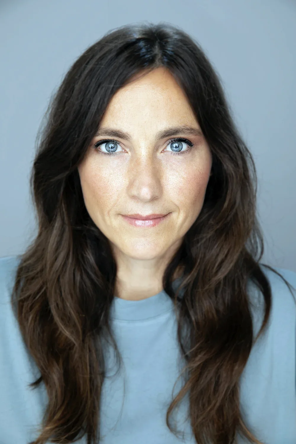
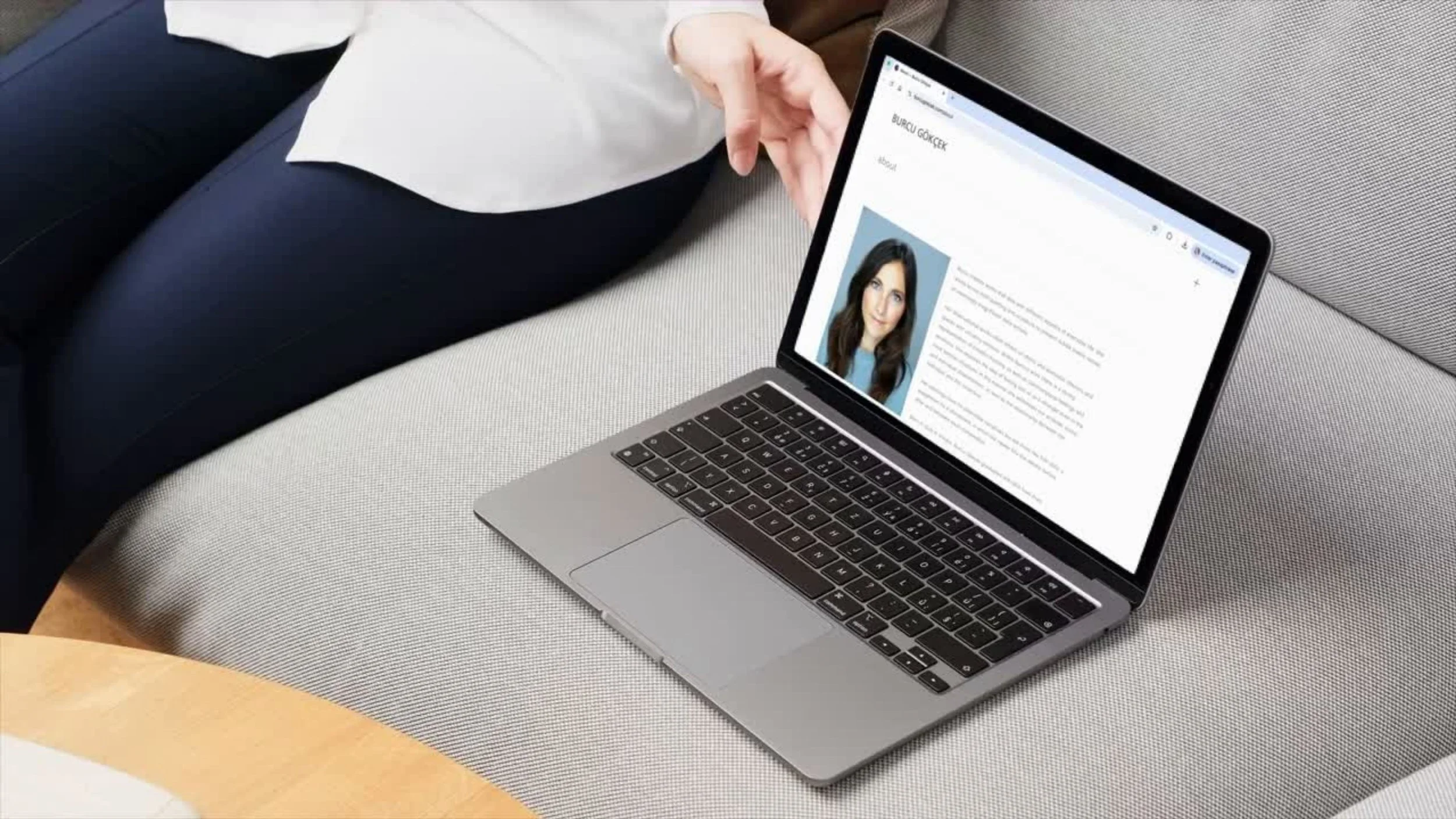
The About page keeps things equally simple. One photo, one text block written by curator Necmi Sönmez, a downloadable CV. That's it.
-the RESULTA portfolio site that actually works like a gallery wall.
The final site does what Burcu needed it to do: it gives her work room. Collectors, curators, and galleries can browse her full body of work without getting lost. Each exhibition series has its own dedicated page with high-resolution images that load clean and sit well on both desktop and mobile.
The site currently houses 11 collections under Works and 5 under Exhibitions, with a Word section for written pieces and press. It's structured well enough that as Burcu continues to produce new work, she can add new series without the architecture falling apart.
Most importantly, it feels like her. Quiet, considered, and intentionally restrained, with just enough personality in the details to feel like a real person's space rather than a generic portfolio template.
“Derin was incredibly dependable throughout the whole process. She was quick to apply any changes I needed and genuinely dedicated to building a site that reflects who I am and how I want my work to be experienced. I never had to over-explain anything. She just got it.”
— BURCU GÖKÇEK