

BACK TO ALL WORKA brand built for boardrooms that don't feel like boardrooms
Global Vortex designs corporate retreats and offsites for companies that want more than a hotel ballroom and a slide deck. I co-founded this venture with my husband Kürşat, and built the entire brand identity and pitch deck from the ground up.
CLIENTGlobal Vortex
SERVICESBranding, pitch deck design
platformFigma
statusComplete
-the brıefThe retreat industry looks the same everywhere. This brand needed to look like nothing else.
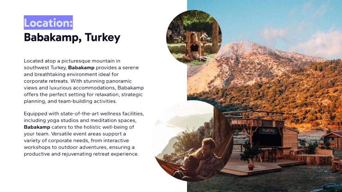
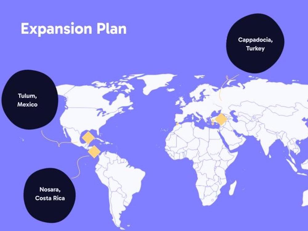
Global Vortex plans corporate retreats, team-building experiences, and strategic offsites for businesses. Not the generic conference room kind. We're talking curated, immersive experiences in places like Babakamp on a mountaintop in southwest Turkey, waterfront glamping at Bonjuk Bay, eco-luxury spaces in Bali, and eventually Marrakesh, Cappadocia, Tulum, and Nosara.
What makes it different from other retreat companies is the tech layer. The retreats use AI-powered customization to tailor every experience to a team's specific needs, plus VR-enhanced sessions so remote team members can still participate in something meaningful. That combination of wellness, cultural immersion, and technology needed to come through in the brand.
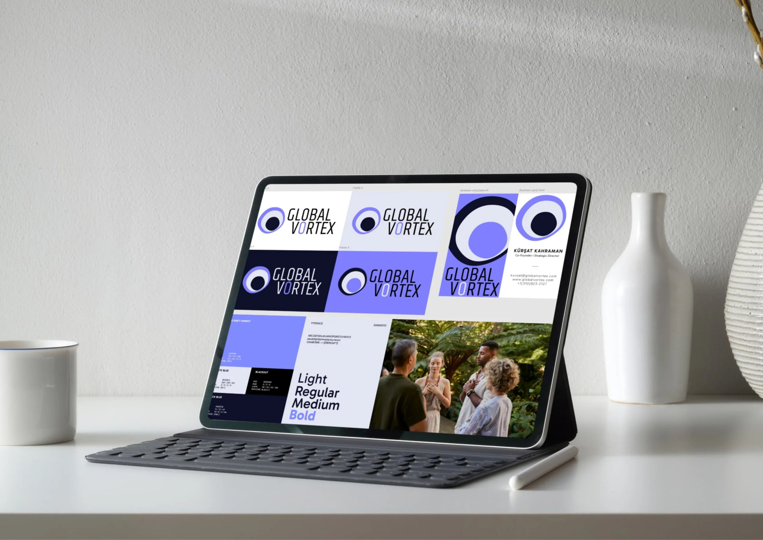
We had the name, the concept, and the locations. What we didn't have was anything visual. No logo, no color system, no brand language, and no way to walk into a meeting and present the business professionally. The job was to build the full brand from zero: logo, color palette, typography, brand guidelines, business cards, social media templates, and a pitch deck that could close deals.
-the challengeMake it bold enough to stand out, professional enough to close deals.
The corporate retreat space is crowded with brands that all look the same. Muted earth tones, cursive fonts, stock imagery of sunsets and yoga mats. The wellness-adjacent ones lean too soft. The corporate ones lean too stiff. Nobody's sitting in the middle with something that actually feels energetic and credible at the same time.
The brand needed to land somewhere specific: bold and memorable enough that someone would remember it after seeing it once, but polished enough to sit in a pitch deck next to budget projections, ROI stats, and logistics timelines. It had to feel premium without feeling stuffy. Creative without feeling unserious. International without feeling generic.
The other challenge was the name itself. "Global Vortex" is strong but it's a lot of word. The visual identity needed to give it shape and anchor it with a mark that could work at any size, from a business card to a 27-slide presentation to an Instagram profile picture.

-THE APPROACHOne symbol to carry everything.
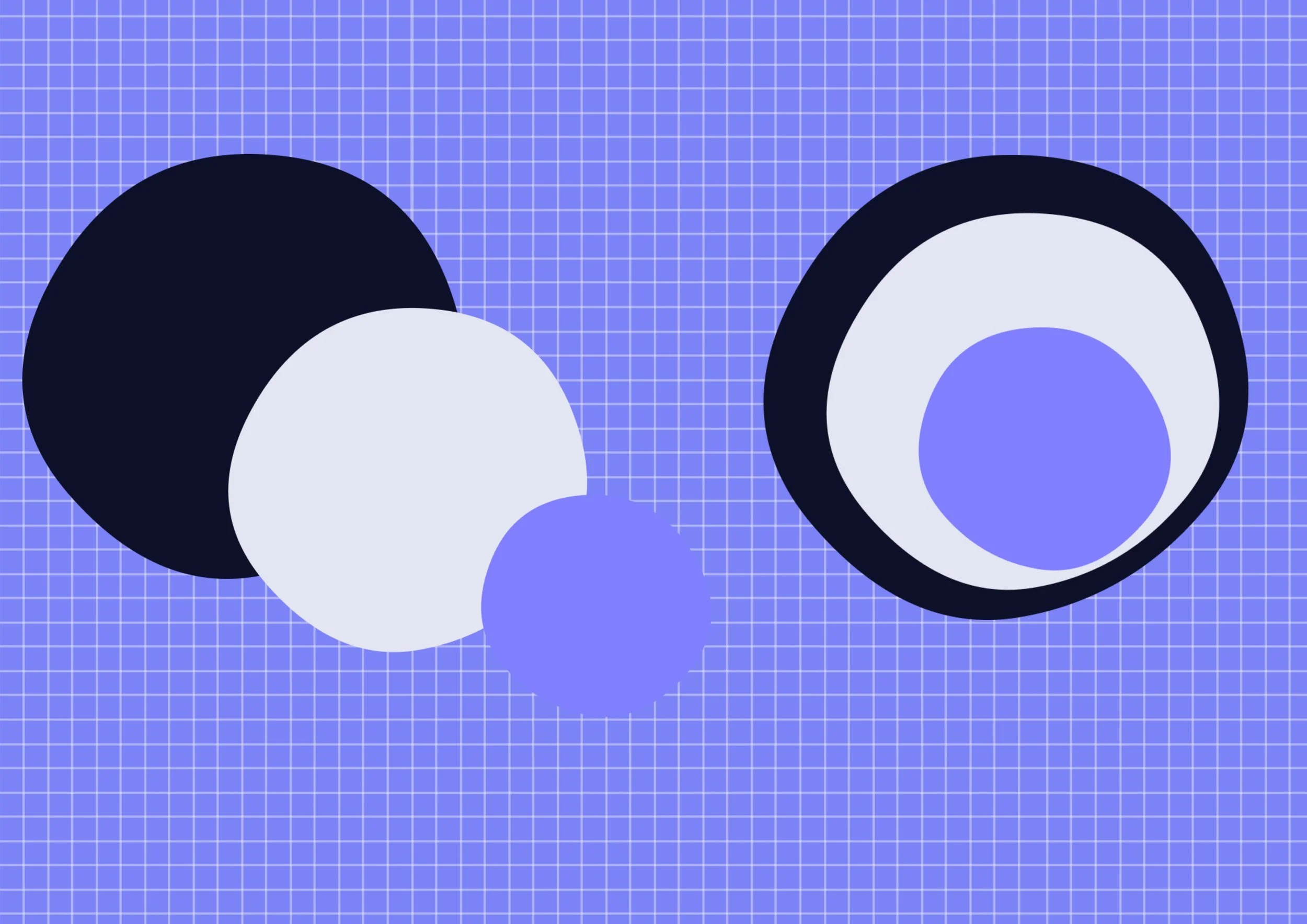
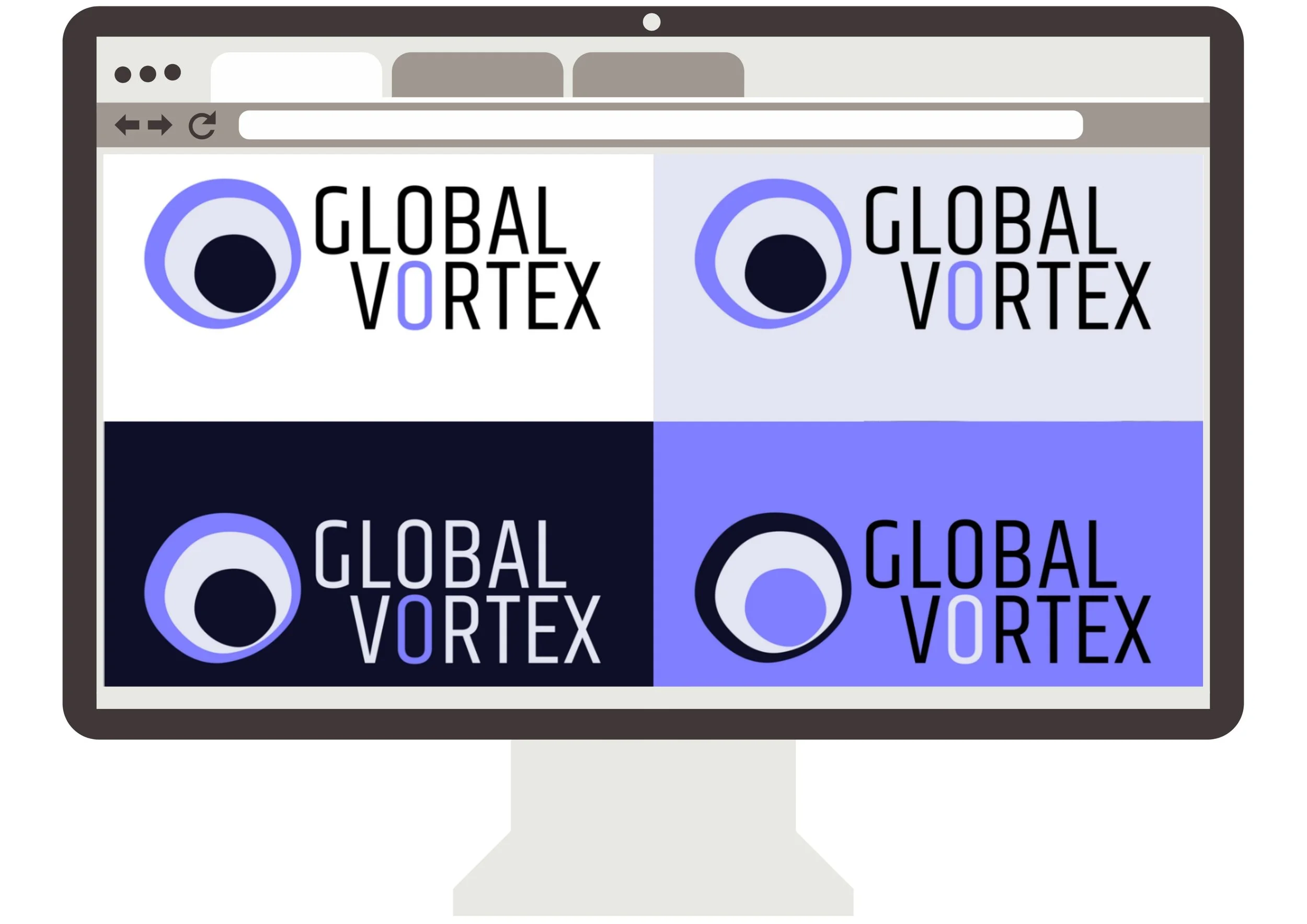
The logo is a vortex seen from above. Concentric circles layered at different depths, pulling inward toward a dark center. It's multi-dimensional on purpose. The layers suggest the kind of transformation that happens beneath the surface, the shifts in team dynamics and individual mindset that you don't always see happening in real time but feel when you come back to work on Monday.
The mark is embedded directly into the wordmark. The O in VORTEX becomes the logo itself, so the name and symbol work as one unit. The O is set in a different color than the rest of the wordmark, reinforcing those layered tones and calling back to the depth of the vortex mark. The brand reads clearly whether you're seeing the full lockup or just the icon on its own.
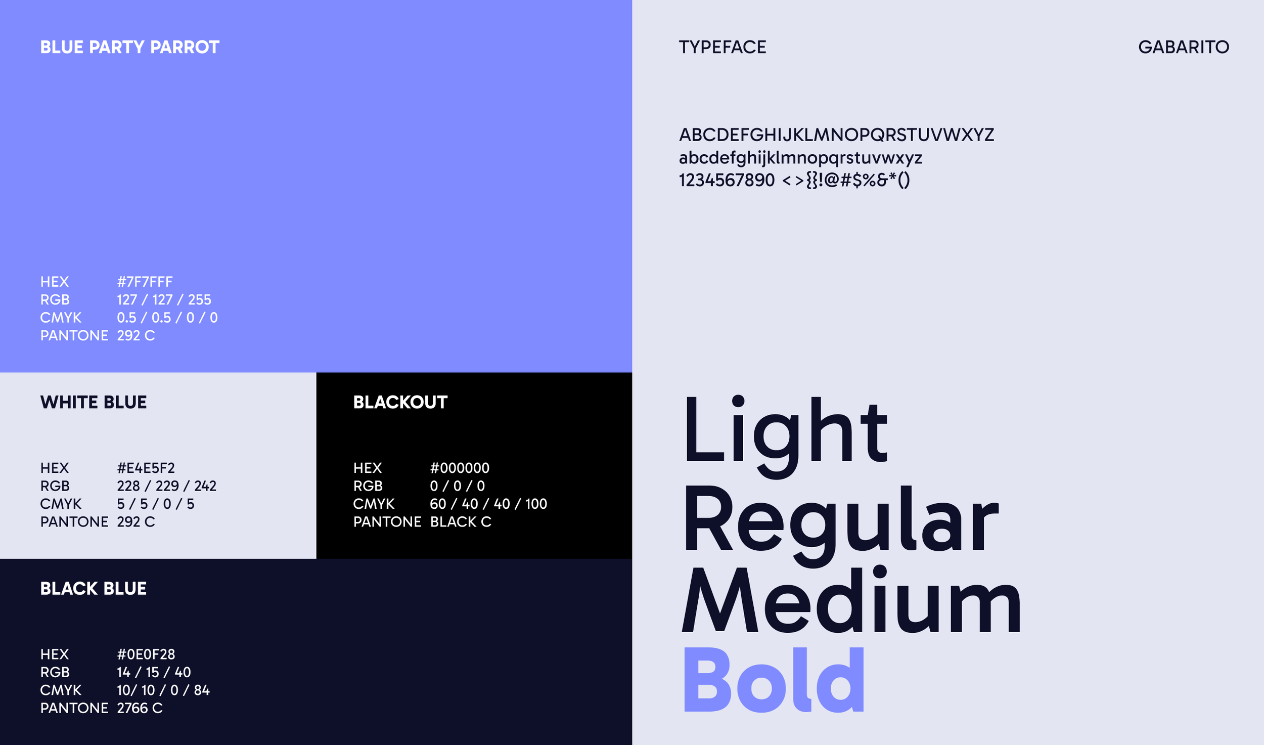
For color, I went with purple tones anchored by Blue Party Parrot (#7F7FFF) as the primary. Purple was a deliberate choice. It represents the unconscious changes we're trying to create through the retreat experiences, the internal shifts that happen when people step out of their routines and into something intentional. It's also not a color you see often in B2B branding, which is the point. It's supported by White Blue (#E4E5F2) for lighter backgrounds, Blackout (#000000) for contrast, and Black Blue (#0E0F28) as the deep navy base for dark applications. The palette shifts between dark and light contexts without losing its punch.
Typography is Gabarito across all weights, from Light to Bold. Geometric enough to feel modern and structured, with subtle rounded details that keep it from feeling cold.
The business card uses a split layout: the vortex mark filling one side in full bleed color, contact details on the other. Simple to read at a glance, distinctive enough to keep.
the Deliverables
-
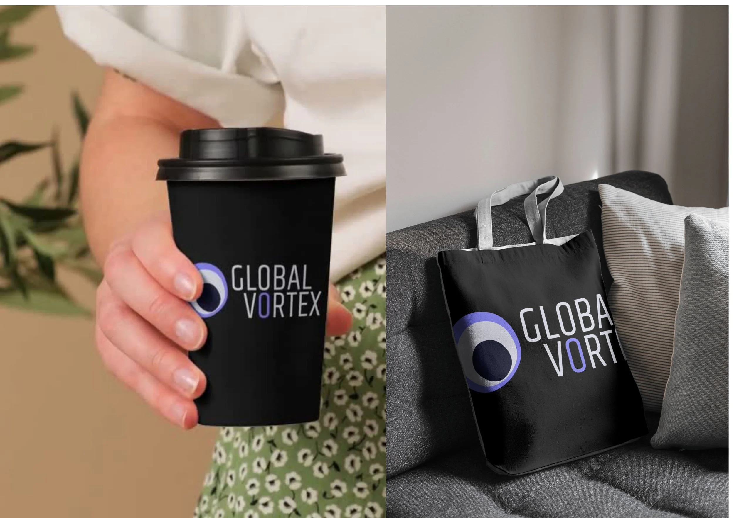
Primary lockup with the vortex mark integrated into the wordmark, plus standalone icon for smaller applications. Four variations across light, dark, and color backgrounds.
-
Four-color system (Blue Party Parrot, White Blue, Blackout, Black Blue) with Pantone, CMYK, RGB, and HEX values for every context.
-
Gabarito in four weights (Light, Regular, Medium, Bold) with usage guidelines for headlines, subheads, body, and captions.
-
Full guide covering logo usage, clear space, color applications, do's and don'ts, and tone direction.
-
Front and back with split composition featuring the vortex mark at full bleed.
-
Branded templates for Instagram, LinkedIn, and presentation formats.Item description
-
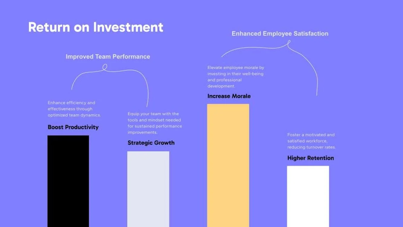
Full investor and client-facing presentation built in Figma, covering company story, mission, team bios, stats and impact data, service offerings, four retreat locations with descriptions, three sample retreat itineraries (wellness, team-building, cultural immersion), client benefits, ROI breakdown, 5-step process flow, and contact.
-the RESULTA brand that competes before a single word is spoken
Global Vortex now has a complete visual identity that works everywhere it needs to: pitch meetings, email signatures, social media, printed materials, and investor conversations. The brand looks intentional and established, which matters when you're a new company trying to win contracts against players who've been around for years.
The pitch deck changed how client conversations go. Instead of explaining the concept and hoping the other side gets it, we can walk into a meeting and let the deck carry the story. Twenty-seven slides that move from origin story to sample retreats to ROI data to a clear next step. The design does the heavy lifting before anyone opens their mouth.
The color choice turned out to be the thing people remember most. In a sea of navy, black, and forest green, the periwinkle catches people off guard in the best way. It signals that this isn't another cookie-cutter corporate services company.